Community Health Maps

Mapping King Tides in Post-Irma Miami

In the last three weeks I've flown to Miami twice, each time for the Community Health Maps (CHM) project. This is a project I've been working on for years. The goal is to empower underserved populations with low cost, intuitive mapping tools. The work is funded by the National Library of Medicine.

I went to Miami specifically to support an already established coalition of organizations working to document the impacts of king tides and help the communities being impacted. The focus was on one particular community, Shorecrest, who's residents are feeling the effects twice a day. "King tide" is basically a popular term for the highest tides of the year. It is sea level rise in action. The groups involved include: New Florida Majority, Florida International UniversityResilient Miami, and Unitarian Universalist Justice Florida.

We had been planning these two trips since summer to coincide with the September and October king tides. The plan was to support the community by training them in how to map these king tide events and their impacts. Then Hurricane Irma hit. I wasn't sure what to expect. Would it be more useful to help people document the effects Irma had on their neighborhoods?  Would people even have time to deal with the king tides in the aftermath of Irma?

When I first landed on September 17th it had only been six days since Irma had blown through. On the surface things looked almost normal. There was very obvious little structural damage. The visible damage from the street was piles of brush and debris on everyone's curb. The hotel was full of relief workers, mostly tree trimmers. Packing for these workshops were also a little different. I expected the water to be polluted, and it was also hard to know what the power situation would be in the neighborhoods I would be visiting. So I brought rubber boots, gloves, a face mask, portable chargers and a water purifier. 

We ended up going ahead with the initial plan. Collectively it was decided that there are often numerous variables involved in king tides such as storms. So the data would still be useful and it would be good practice for the community. Plus we might learn if there was more bacterial contamination resulting from the hurricane.

I thought this effort would be a perfect use of the new Fulcrum Community accounts. So Susan Jacobson from FIU applied for an account. It was immediately granted and we ended up using that. Jacobson and Tiffany Troxler from FIU, and Jan Booher from UU had already developed a water sampling protocol. They had refractometers for measuring salinity and bottles for collecting water samples. The bottles had a reagent in them that would tell us whether the samples were infected with bacteria such as coliform.  They also had yard sticks for measuring flood depth.

A King tide data collection kit

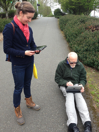
Two days ago I returned from the second trip to Shorecrest. Over the two trips I conducted several workshops with: people living in Shorecrest, students at FIU and community leaders. Using Fulcrum Community allowed me to focus on data collection with the community members. The only tech piece involved showing them how to use the Fulcrum app on their phones. That allowed our team to spend more time teaching about the actual water sampling protocol. Following that I taught a more involved workshop to the community leaders. There I showed how to manage the data and map it via QGIS and Carto. Going forward it will be their project to manage and I'll just serve in a support role. On October 7th there were dozens of people out collecting data!

Residents mapping and sampling King tides

The interesting thing about King tides is that they can come up via storm drains. The Shorecrest neighborhood we worked in is close to the coast, but not right on the coast. However, it is in a particularly low lying portion of Miami. During these king tides water comes up through these storm grates two times a day, flooding the streets, driveways and yards up to 2-3 feet in depth. The water is saline and initial water samples show that most has some level of bacterial contamination. The video below shows the flooding on October 7th at the intersection of NE 78th & 10th streets. 

Recently there have been some heavy rains saturating the soil and creating minor flooding in low lying areas. On October 7th the twice daily tidal flooding just added to it. The king tide water came up through the storm drains, cracks in the asphalt and the ground. The water rose up to knee level in a little over an hour. It flooded the Little River Pocket Park, streets, peoples driveways and yards. Trash piles from Irma are still there and are now potential sources of bacterial pollution. Most residents are also still dealing with mold and flood damage from Irma. It is not a good situation. Below are some before and afters that show the situation: 

Little River Pocket Park - before

Little River Pocket Park - during king tide

Before...

During king tide

Before...

During king tide

It was really powerful to be dropped into this community of Shorecrest, meet real people with real problems, and be able to help in some small way. My goal has always been to use the technology to help make the world a better place. I've also always been an activist. This work felt good from both perspectives. Disasters always affect poor areas the most and this is no different. It's a pretty grim situation that isn't getting much press. I'll be following up with some results in the near future, building on the initial map below.

Coffee, Community Health Maps & My Favorite Coffee Shops Visited in 2016

For the last couple of years I've been working on a project called Community Health Maps for the National Library of Medicine. The goal is to empower public health organizations working with underserved and at risk populations with mapping technology. We aim to help people who don't have backgrounds in computer science or geospatial technology, and don't have budgets for ArcGIS licenses. I've helped develop a program to show these people how they can 1) use Fulcrum to map their communities with smartphones, 2) map that data with Carto and 3) go even further with QGIS. 

Coffee Brewers

Coffee Brewers

This work takes me all over the country teaching half-day workshops. I've got it down at this point. In 3-4 hours I can teach 20-40 people who have never done any kind of map work how to collect data and map the results in Carto and QGIS.

I'm also a coffee geek. I've been hooked by the third wave coffee bug.  I take my coffee seriously as evidenced by my collection of brewers! My wife also compiled the video below of coffee roasters we tried in 2016.

For each training location, I assemble local data from OpenStreetMap and/or local sources. I always include a layer of the local coffee shops to try. After all, I'm going to try them anyway. It's a hobby of mine. Plus it makes it a little more fun, after a few hours of training, to have them open up a QGIS map showing the training location and some coffee shops to try. I usually google 'pour over' coffee in the area, and am sure to exclude all the Starbucks. To me one key to a quality coffee shop is the length of their menu. The shorter the menu the better. For example, I love this menu from Ninth Street Espresso in NYC.

In the last year or so I've been to Charleston 3 times, Seattle twice, along with Spokane, Honolulu, Lawrence, Washington DC and Salisbury MD. I've also been to NYC, Raleigh NC, Portland OR and Denver CO for other business trips. I finally got around to compiling a map of the best coffee shops I've been to in the last year. There are some good ones not on here, these are just the best of the best.

Of these Milstead and Co in Seattle is my favorite. They aren't a roaster but it is simply the best coffee shop I've ever been to. They make each each cup of coffee individually via AeroPress and offer an amazing selection of coffees to try. They are followed closely by Coava in Portland, Toby's Estate in Brooklyn, Black Tap in Charleston, and Boxcar in Denver.  Below are some shots from these coffee shops. Coffee and GIS were made for each other!


Black Tap - Charleston

Milstead & Co - Seattle

Toby's Estate - Brooklyn

Boxcar Coffee Roasters - Denver

Coava Coffee - Portland

If there isn't a good coffee shop I'll bring my Porlex mini grinder, some good beans an my Aeropress. Makes a great cup o' joe in my hotel room! Try it!

A Trip to Maryland to Teach Three Mapping Workshops

Last week I traveled to Maryland. I taught two workshops at the Prince Georges County Department of Social Services for people working on homeless issues. As with most Community Health Mapping workshops, all attendees were novices to mapping technology. However, in the first hour they all built a data collection form in Fulcrum and went outside to collect some data around the building.

Prince Georges County Community Health Mappers

Prince Georges County Community Health Mappers

The attendees represented a variety of organizations including many working with YouthREACH Maryland. REACH is an acronym standing for Reach out, Engage, Assist, & Count to end Homelessness. It is an effort to obtain accurate, detailed information on the number, characteristics, and needs of unaccompanied homeless youth in Maryland. Other organizations represented at these workshops included:

  • Maryland's Commitment to Veterans
  • Maryland Department of Planning
  • Prince Georges Community College
  • St Ann's Center for Children, Youth, and Familes
  • Maryland Multicultural Youth Center
  • So Others Can Keep Striving (S.O.C.K.S)
  • Sasha Bruce Youthwork
  • Lifestyles of Maryland.

In the final two hours of the workshops attendees learned how to map the data they collected in both Carto and QGIS. We also had time for a brief discussion about how CHM could be used in their projects. There were a lot of ideas shared about how the technology could help community engagement.

The afternoon workshop attendees feeling accomplished after completing their Carto maps!

The afternoon workshop attendees feeling accomplished after completing their Carto maps!

After the two PG County workshops, CHM traveled across the Chesapeake Bay bridge to Salisbury University on the eastern shore.

The following morning I taught a workshop geared towards social work students at Salisbury University. Attendees went through the CHM workflow and were introduced to FulcrumCarto and QGIS. Below is a map of data collected around the student center in Carto.

Salisbury University Data Collection in Carto

Salisbury University Data Collection in Carto

The workshop concluded with a short introduction to working with data in QGIS.

Salisbury University Data Collection in QGIS

Salisbury University Data Collection in QGIS

That afternoon I'd hoped to catch up with Art Lembo who wrote How Do I Do That In PostGIS? I realized at the last minute that the author of this little book I've had on my bookshelf works at Salisbury University. Unfortunately he was under the weather. FOrtunately I had time to drive to the Delaware shore for a quick beach walk.

The next scheduled workshop for the Community Health Maps team will be at the Teaching Prevention 2017 Conference in Savannah, Georgia. That conference takes place from April 5-7th. If you are interested in learning this technology this workshop will be a great opportunity!

Announcement: New Community Health Mapping Blog

Community Health Maps - Information on Low Cost Mapping Tools for Community-based Organizations

Kurt Menke, of Bird's Eye View, is contributing to a new FOSS4G related National Library of Medicine blog: Community Health Maps. The goal of the blog is to provide information about low cost mapping tools that can be used by community based public health organizations.  Perhaps you’ve seen the potential uses of mapping in public health, but are overwhelmed by the technology and/or simply too busy to pursue it.  I hope this blog will facilitate the use of GIS mapping for those that fall into this category.  I also hope to support those already engaged in mapping and enhance their community mapping initiatives, even if they may be using other tools.  The blog will be a mixture of mapping apps/software reviews, best practices, and the experiences of those who have successfully implemented a mapping workflow as part of their work. Training materials developed in 2013 are also available.

Low Cost Tools for Mapping Community Public Health

The past week was spent conducting training sessions on how to use a low cost workflow for public health mapping in minority communities. Trainings were conducted at two sites. The first site was the Urban Indian Health Institute in Seattle, Washington. They are monitoring noise pollution in urban indian populations. The other Papa Ola Lokahi in Honolulu, Hawai'i. They are working on a community public health assessment. The workflow starts with data collection using iPhones/iPads, moves into working with the the data in QGIS and finally data presentation via GIS Cloud.

Taking GPS and decibel readings in Seattle.There is an ever expanding ecosystem of geospatial apps for iOS. For this project we are evaluating EPICollect and GIS Pro. EPICollect is a free app designed to collect point data with a custom form. GIS Pro is a very expesive app. However, with the price comes a very intuitive and robust data collection system. 

An assortment of mapping apps for iPad

Once data is collected QGIS is used to combine the data with other organizational datasets, conduct spatial analyses and prepare maps. GIS Cloud is being used for final online presentation.