QGIS

Creating a COVID-19 Temporal Animation with QGIS

One of the most powerful new features released with QGIS v3.14 is the Temporal Controller, which allows you to enable time in your maps. It can be used to temporally enable vector, raster, mesh and WMS(T) data. The Temporal Controller is now a core part of QGIS and has several variables associated with it that allow you to create powerful visualizations and animations. It contains most of the functionality found in the Time Manager plugin.

Here you will learn how to use it with the New York Times COVID-19 data to produce a county-based animation of the outbreak in the U.S.

Getting the Data

To begin, download the current New York Times live COVID-19 data, a U.S. Counties with population shapefile and a State boundaries layer from the U.S. Census. Unzip the county and state data.

Add the Data to QGIS & do some basic styling

Add all three datasets to QGIS 3.14, then use either the QuickMapServices or MapTiler plugin to add an OpenStreetMap basemap. If you have not installed these, you can do so from the Plugins menu option Manage and Install Plugins.

Next you will symbolize the States with a simple black outline and no fill. Press F7 to open the Layer Styling Panel. Make sure the states layer is the target layer in the panel.

  • Select the Simple fill component.

  • Change the Fill style to No brush.

  • Increase the Stroke width to 0.46.

The NYT data is structured such that there is an entry for each county for each day of the pandemic. For each date it has both the cumulative number of confirmed COVID-19 cases and deaths.

2020-08-10_162130.jpg

Processing the Data

The only data processing step is joining the COVID-19 data to the counties layer by FIPS code. This is a 5 digit code (2 for the state and 3 for the county) which is a unique identifier for each county in the country.

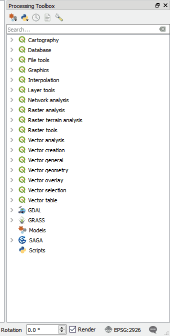
You will use the Join Attributes by Field Value processing algorithm. Use the Processing menu to open the Processing Toolbox. Use search box at the top of the Toolbox to search for ‘Join’. This will filter the available tools. Locate the Join Attributes by Field Value processing algorithm in the Vector general section. Fill it out as shown below being careful to select the Join type of Create separate feature for each matching feature (one-to-many).

Warning: This is going to create a very large dataset with over 400,000 features. It may take quite awhile to process depending on the speed of you machine.

2020-08-10_163329.jpg

Symbolizing the COVID-19 Data

When the data has been processed you can symbolize it. Again the size of this dataset makes it a bit unwieldy. Since the goal is an animation which builds towards the current total of COVID-19 cases, you want to set up the classes so they make sense for the latest date in the dataset. To figure this out, you will temporarily filter the data for the most current date.

  • Open Layer Properties for the layer.

  • Choose the Source tab.

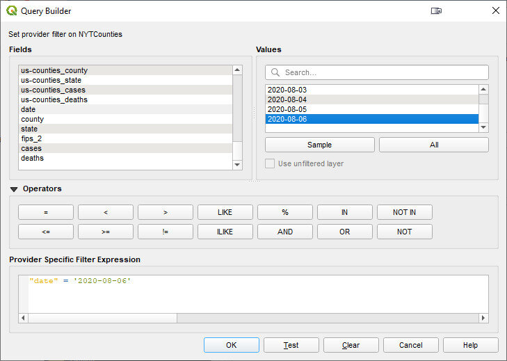
  • In the Provider Feature Filter section click on the Query Builder button.

  • In the Fields box highlight the date field.

  • In the Values box click All. Again this is a big dataset so it may take a few moments for QGIS to compute a list of all the dates.

  • Form an expression in the Provider Specific Filter Expression box. First double-click on the date field to enter that in the lower box. Then click on the equals operator. Finally double-click on the most current date.

  • Click OK.

2020-08-10_164257.jpg

When finished, a small filter icon will appear to the right of the layer in the Layers Panel. If you hover over that filter your expression will appear. Now you will work on styling the filtered dataset.

  • Make sure the correct counties layer is the target layer in the Layer Styling Panel.

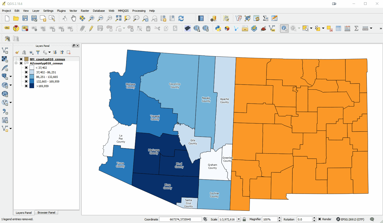
  • Where it reads Single symbol, change it to Graduated. The Graduated renderer allows you to symbolize the counties based on a numeric field.

  • You can begin by simply choosing the cases field as the Value.

  • Click the Classify button and you will see the counties classified into the default 5 classes in your default color ramp.

  • Choose Equal Counts as the Mode.

  • Increase the number of Classes to 7.

  • Use the Color ramp selector to find a nice color ramp. Here I’m using the RdYlBu ramp.

  • Right-click on it and choose Invert. This is necessary if using the RdYlBu ramp so that the counties with the highest number of cases are red.

  • Next you will change all the outlines for all the classes to a thin white line. To do this, click on the colored bar next to Symbol.

    • Select Simple fill.

    • Change the Stroke color to white and the Stroke width to 0.06.

    • Click the blue back arrow button to return to the main layer styling options.

2020-08-10_171438.jpg

Normalizing the data by population

This is now turning into a nice map. However, it will be more informative to normalize the number of cases against the population. Otherwise we risk making a map of just population centers. In the Value section where you chose cases as the field, click the Expression button. The Expression Dialog window opens with cases as the expression. Here you will divide cases by population and multiply by 1,000,000. This will give you the cases as a rate per 1,000,000 people. ‘

2020-08-10_172204.jpg
  • Put your cursor to the right of the word cases and click the / division symbol button.

  • Expand the Field and Values values section. You will see a list of all the attribute columns in the dataset.

  • Double-click on POPULATION to add field to your expression.

  • Next, wrap cases / “POPULATION” in parentheses.

  • Finally, enter a multiplication * symbol followed by the number 1000000 without thousands separators.

  • Click OK.

  • In the Layer Styling Panel click Classify again to see your map as cases per 1,000,000. You can also enter custom values. For example, you can set the upper limit for the first class to an even 2,500 versus the 2,508.62.

2020-08-10_172443.jpg

Now that you have the styling set, you will clear your layer filter. Click on the filter icon in the Layers Panel to open the Query Builder. Click Clear and OK.

Working with the Temporal Controller

Now you can work with the Temporal Controller.

  • Open Layer Properties for the counties layer and choose the Temporal tab.

  • Set the Configuration to Single Field with Date/Time and point it to the date column.

  • Set the Event duration to 1 week.

  • Close Layer Properties.

2020-08-11_081417.jpg

The layer will likely take awhile to render so you may want to turn it off now that you have it set up.

Decorations

Next you will work on some Decorations to add to the animation. These will allow you to add a title, legend and data source to the map canvas.

From the View menu find Decorations and choose Title Label. Click Enable Title Label and enter COVID-19 Cases per 1M by Date (NYT). Choose a font and a background color and click OK.

To add the legend to the map canvas, you will set one up in the Print Composer. Start a new Print Composition and add just a Legend. Configure it how you’d like and take a screenshot or reduce the size of the composition to fit to the legend and export it as an image.

Back at the main QGIS window revisit View —> Decorations and choose Image. Click Enable Image and load your legend. Use the Size and Horizontal/Vertical settings to place it in a good spot.

You can use the View —> Decorations—> Copyright Label to put the url to the New York Times GitHub repository on the map.

2020-08-11_082636.jpg

Labeling Time

Finally you will create a point layer to place the current day on the map. Click on the Layer menu and choose Create Layer —> New Geopackage Layer. Be sure to make it a point layer.

2020-08-11_083127.jpg

Put the layer into edit mode and create a point where you’d like the date to appear. Save your edits. Open Layer Properties and select the Temporal tab. Enable Temporal and set the Configuration to Redraw Layer Only. This tells QGIS to redraw this layer each frame.

Now you will symbolize and label this layer. For symbology change the renderer from Single symbol to No symbols. You don’t need to see the point. You will be using this layer to simply label time.

In the Layer Styling Panel switch to the Labels tab. Set labels to Single Labels. Click the Expression button to the right of Value. There are a series of variables tied to the Temporal Controller. Expand the Variables section and double-click on the @map_start_time variable to add it to your expression. This variable represents the start of the map’s time range. As you step through time on the map, this variable will update to represent the current start date for the map. You can use the format_date() function to put this time into your preferred format. If you highlight the format_date() function you will see some help in the right side of the expression window. Reference the example below. Also note that QGIS provides a preview of what your expression returns. Look in the lower left corner of the expression window. You can check this to ensure the expression is formatting the date as you wish. When finished click OK.

2020-08-11_084008.jpg

Lastly, choose a font for your time label.

Activating Time

Now you are ready to activate the Temporal Controller panel. Click on the Temporal Controller button on the Map Navigation toolbar, or use View—> Panels to activate it. Once visible, click the Animated Temporal Navigation button (right-most with green arrow) in the Temporal Controller panel.

2020-08-11_084703.jpg

Exporting Still Images

Set the Step to 1 days. You can now use the Temporal controls to step through time. However, the data are so large it will probably be awkwardly slow. Notice the Export Animation button to the right of the Step. Click this, and set it up to export out a series of still images, one per day.

2020-08-11_084932.jpg

Creating the final Animation in GIMP

Once the images have exported you can use the open source image editing software GIMP to create the animation. You can install it from the link.

Open GIMP and choose File —> Open as Layers. This will likely take a couple minutes as it loads all the still images.

2020-08-11_085248.jpg

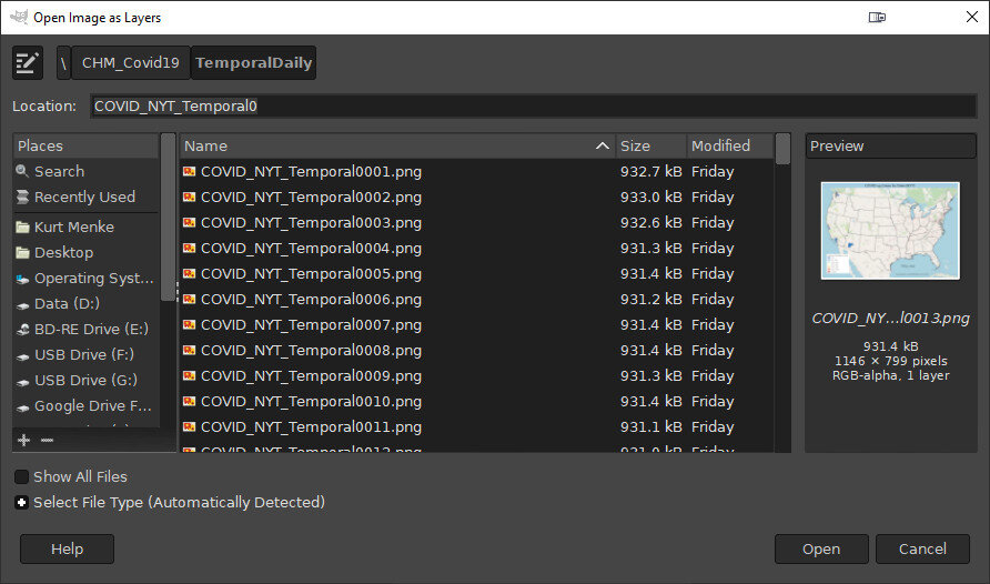
Once it has finished loading the layers click Filters —> Animation —> Optimize (for GIF). This step too will take a couple minutes. Finally choose File —> Export As and export as a GIF. Set the File type as GIF and choose a folder for the export. Click Export and in the Export Image as GIF window be sure to check the As animation box. You can also choose the Loop forever option.

2020-08-11_090309.jpg

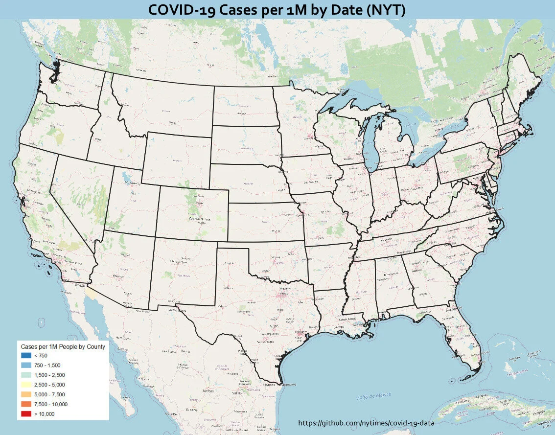
You will end up with something similar to the animation shown below! This same workflow can be used to create similar animations for deaths or for other countries.
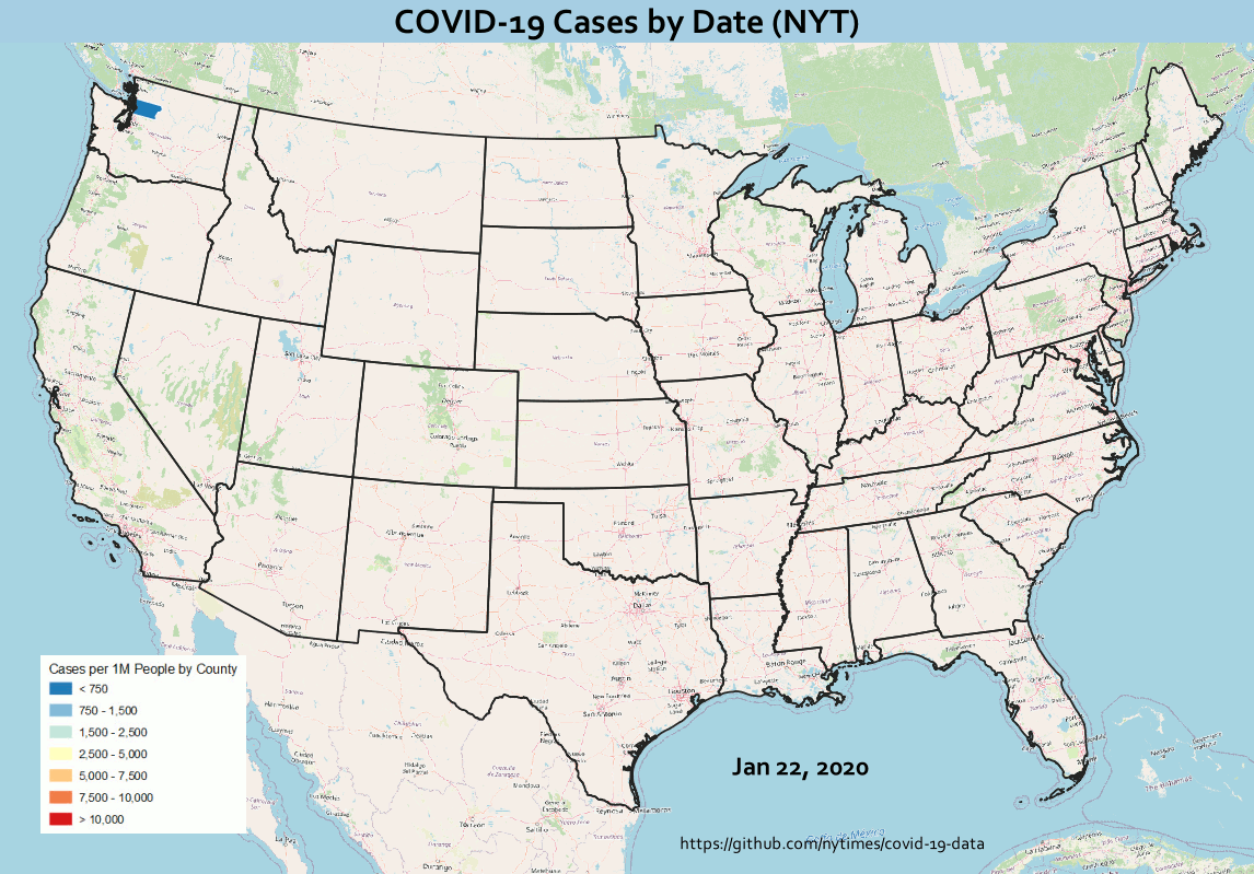
Final Animation

Final Animation

Experiences Teaching QGIS in the Time of COVID-19

Last year I completed what I called the QGIS Hemisphere Workshop Slam. I taught at least one QGIS workshop in the eastern, western, northern and southern hemispheres. Obviously that is not happening in 2020. It was a travel year that will likely never be repeated. From a sustainability perspective it is a good thing. From a community building perspective the lack of face-to-face meetings is challenging.

QGISWorkshops2019.jpg

Last Friday (June 12th) I taught an online 3 hour Data Visualization with QGIS workshop for FedGeoDay2020 using Zoom. It was the first time I’ve taught a virtual hands-on workshop to a large (~40) dispersed group. Last year I taught a multi-day course to a company in Canada, also using Zoom, but there were only 12, they were all in the same room and there was a facilitator. All my prior workshops have been face-to-face.

I really didn’t know what to expect. In my experience, success in a workshop depends to a large degree on: A) the skill level of the group and; B) whether they all work at roughly the same speed. This is especially true for workshops where anyone can register. This was an easy group from both of those perspectives. (I think there is another blog post coming about ideas in this paragraph)

I was pleasantly surprised with how smoothly it went. This was partly dumb luck. I am in the western US and got an afternoon time slot. The organizers had intended workshop to be run with everyone using Amazon Workstations. The machines were pre-loaded with workshop data. Unfortunately, those teaching in the morning discovered the virtual machines weren’t going to perform well and had to abandon the strategy mid-workshop. Had it worked it would have been brilliant. The whole thing was experimental and there were some lessons learned. I’m just grateful I had a chance to change course.

Hearing this news, I quickly made the data available via Google Drive and set up some instructions for software installation. When we started I provided the link and instructions. We spent the first ~10 minutes getting set up and the rest went smoothly.

ZOOM CHALLENGES

My biggest challenge teaching via Zoom is not being able to see peoples computers. I can’t help them debug. If it’s a small group they can share their screen, but this group was way too large for that. I was also worried I would have trouble pacing it. How would I know if people were finished with an exercise or needed more time?

Another challenge is managing questions via the chat box. This spring, Hans van der Kwast (my co-author for QGIS for Hydrological Modeling) and I put on a seven part webinar series. During those, one of us would teach and the other manage the chat. (You can watch all seven webinars, one per chapter, on YouTube here). It worked brilliantly and the turnout was phenomenal. We had 373 people register representing 86 countries!

However, for last weeks workshop I was solo. In preparation, I read Ujaval Ghandhi’s post where he shares his experiences teaching online and tried to prepare accordingly. I also read Andrew Cutts post. I recommend them both!

WHAT WORKED

Here are the strategies that worked well for me:

  • To keep track of peoples progress, I had them either use Reactions (give me a thumbs up when they finished a section), or give me some indication via the Chat box. I could also tell it was fast group and that they seemed to be working at the same pace. That’s just luck.

  • For other large groups I’ve been in the habit of using animated gifs for teaching. These allow the workflow to “play” onscreen while I walk around the room helping people. It’s really effective. I hoped this would work equally well in this situation and it did. I could leave a slide up and while people were watching I could monitor the chat window and answer questions.

  • Lastly I gave a 10 minute break every hour.

We got through all the material in the 3 hour session and I had positive feedback.

I hadn’t planned on recording the session. However, someone asked about it and it’s easy to do via Zoom. I did some minimal editing to give a nicer opening and take out the breaks. The workshop is available in its entirety here.

OTHER ONLINE EVENTS:

So far, during the COVID-19 pandemic, I’ve had great experiences with webinars and now a workshop. I’ve also really enjoyed watching webinars and conferences others have put on. Nyall Dawson recently taught two must see webinars (QGIS 3.14 time handling and map animation & QGIS Expressions, variables, and data defined settings: putting it all together). Then this week OsGeo:UK hosted the virtual FOSS4G UK Online 2020 conference which was fantastic. I understand videos will be coming in the next week. One I recommend watching is Steven Feldman’s (@StevenFeldman) talk Running an Online FOSS4G - some reflections. He gave a really thoughtful overview of the future of FOSS4G conferences. Nick Bearman’s talk on Teaching QGIS: Certification and Running QGIS in the Cloud, I missed, and look forward to checking out. I also recommend Jorge Gaspar’s (@xurxosanz ) review of the FOSS4G UK Online conference! I am happy to see all of these events be so successful. They help democratize learning technology. They have been free and open to anyone. They also help maintain our community connection.

Next month QGIS-US is hosting a one to two day conference: QGIS North America 2020. Then in August I will be working with the Australian Water School on a webinar series: QGIS for preparing and visualising hydrological data.

Time zones are the biggest hurdle for live events. One solution is recording them and making the content available, as most are doing. For the foreseeable future these are how our communities will be meeting, and thankfully it’s working.

A QGIS Training in American Samoa

My final QGIS training trip of 2019 was a long one - to American Samoa. I flew to Honolulu & took a right for another 6 hours to the island of Tatuila. I basically commuted to Pago Pago for the week - leaving Monday morning and returning Friday night. While there I taught a 3 day QGIS course to staff at the Department of Health. With this training I completed the QGIS Training Hemisphere Grand Slam - that’s one QGIS training in each hemisphere - Eastern, Western, Northern and Southern - in a calendar year! The timing of the trip was interesting. If you haven’t heard Western Samoa is experiencing a serious measles outbreak. While I was there no cases had occurred on American Samoa largely due to the diligence of the AS Dept of Health.

2019-12-13_163127.jpg

I had planned on starting with how to install QGIS - but soon discovered the WiFi was going to be an issue - the QGIS installer was going to take 12 hours to download! So I switched gears. Flexibility was a big theme for the week. One person went down the street with a thumb drive, to download the installer at a building with a better internet connection. Meanwhile the remainder learned how to collect data with Fulcrum.

Learning about Fulcrum.

Learning about Fulcrum.

It ended up working out great. By the time we had gotten through data collection, we had the QGIS installer on thumb drives, and got everyone set up. I spent that first afternoon using the data collected to introduce QGIS.

DQ3x_thumbnail150px.png

This training was set up at the last minute. So last minute in fact, that I didn’t have time to order Discover QGIS 3.x books in time. I ended up just bringing a few I had on hand. I also didn’t have any training material with Samoan data. It is such a unique geography, I realized I would need some local data for them to work with. Fortunately I had a couple days in the office before I left, and found some good Samoan data. The last two training days turned in to a combination of walking through how to do different things in QGIS (on-the-fly with that Samoan data), with follow up exercises out of my Discover QGIS 3.x book. The latter really helped to reinforce the concepts and workflows. It ended up working out great.

Due in part to the measles outbreak on the neighboring islands, everyone was super busy. Many were in and out of the training to deal with work issues. When they returned I would then try and catch them up. One thing I loved about this group was that almost before I would have a chance, they would start helping each other catch up! I’m not sure if I’ve ever had a more enthusiastic bunch.

Working through an exercise in Discover QGIS 3.x

Working through an exercise in Discover QGIS 3.x

We got through everything I had planned and more. I was also sure to let them know about FOSS4G Oceania. I shared the links with them - including To’oa Browns talk about addressing in Western Samoa. Her part of the talk is especially pertinent for these American Samoan health workers - because AS shares the issue of having no street addresses! I hope some can attend next years FOSS4G Oceania meeting in Fiji.

The final group of QGIS Survivors!

The final group of QGIS Survivors!

There is now a lot of excitement and a decent QGIS foundation. While I was there they formed a QGIS study group. I also gave them assignments to work on post-training. So there is a good foundation now. We talked about continuing to build their skills and not have this be a one of training. I look forward to returning - hopefully next year. Each evening they would take me around to show me a new place. It was more beautiful than I was prepared for. Below is a picture of the National Park of American Samoa.

Esri and Me - Part 4 - Education

In previous posts (Part 1 - Part 2 - Part 3) I’ve shared some painful experiences I’ve had with Esri through the years. Here, I am sharing what I see as a partial solution - education.

A long-term goal of mine is to help diversify the GIS/Geo offerings of universities and colleges. A colleague, Dr. Phil Davis, conducted a survey several years ago and established that 95% of the GIS curricula in U.S. colleges and universities are based on Esri software. This presents both practical and ethical issues. Students typically have access to a free Esri license while in school. However, most are due for a rude awakening if they want to start consulting work in GIS after graduation, or simply continue their GIS education. I have always felt schools have an ethical obligation to teach a few FOSS alternatives. Students deserve the opportunity to learn and use technology regardless of their social or economic status. Plus, with the sheer number of tools for doing geo things, being limited to a single vendor is a serious professional limitation.

In 2008 I developed a semester long course named “Introduction to Open Source GIS.” I’ve been teaching this ever since at my local community college. As in most schools, students show up on the first day having been taught an Esri curriculum - to the complete exclusion of anything else. Most of these students are shocked to learn of the diversity of FOSS offerings. Early in the course I like to have a reprojecting race on a local streets layer between ogr2ogr and ArcMap. It blows minds! Spoiler alert: ogr2ogr wins. After being exposed to GDAL, QGIS, PostGIS etc., there is usually someone who asks, “Why is no one talking about these?” Over the years an important trend has become clear to me. At some point - as students learn to replicate a workflow in a different software - they stop just pressing buttons and begin to think about the data, what they are doing with it, and the results. Critical thinking should be the goal of any geo course.

Open Curricula

To help diversify GIS offerings I have worked on a number of open curricula. In 2014 I helped create the GeoAcademy. The original motivation behind this was to produce material that could be easily used, in whole or in part, by instructors wanting to incorporate FOSS4G into their curricula. It is based on the U.S. Department of Labor’s Geospatial Competency Model (GTCM). The GTCM is a hierarchical model of the knowledge, skills, and abilities (KSA’s) needed to be a working GIS professional in today’s marketplace. The GeoAcademy includes 35 FOSS4G university-level lectures and labs. Each lab task even has a YouTube video. This material is becoming dated but is still available. More recently I helped develop an open GIS-based curriculum on Tropical Cyclones. It’s a four unit series of exercises which use spatial data and QGIS to teach earth science. It’s aimed at early college students.

Discover QGIS 3.x

Discover QGIS 3.x - released in May with Locate Press, is largely based on The GeoAcademy. It too is designed for the classroom. The first three parts are updates to the original GeoAcademy labs. In addition, I augment that material with features I find invaluable in my day-to-day work as a GIS consultant. This 400 page workbook represents the best parts of the GeoAcademy, combined with my diverse experience teaching QGIS and using it in an applied work setting. It introduces the QGIS interface and covers: basic GIS concepts, spatial analysis, modeling, data creation and editing, cartographic design and data visualization. GDAL/OGR and PostGIS are also introduced. The material is modular. Instructors can opt to use the book in its entirety or select specific exercises to augment their courses. There are solution files for each exercise and many exercises include a challenge and discussion questions.

To help get it out there, I ordered a stack of postcards advertising the book. I mailed these to a minimum of two universities/colleges in each of the 50 U.S. states. I also mailed them to many people internationally. Cards went to hundreds of geo-librarians, professors, lab managers, instructors…. At the very least my hope is that this book gets into university libraries. If you know of a school or professor who could use some inspiration, let me know! Getting students introduced to FOSS4G software is the best way to start having it be more widely used and adopted.

20191029_104035.jpg

QGIS for Hydrological Applications

In September the latest book with Locate Press - QGIS for Hydrological Applications - Recipes for Catchment Hydrology and Water Management - was published. This book, co-authored with Dr. Hans van der Kwast, was written with a similar intent. It is based on an open curriculum developed by Hans. IHE Delft is a model school because QGIS is the default GIS and the curricula developed there are all published with an open license. The book is the first of its kind, covering QGIS applied to a specific topic. Another feature is that it uses open data throughout. Our hope is that educators will use this book to introduce students to QGIS while learning basic hydrological concepts, and open data. With this book students learn to:

  • Georeference scanned maps

  • Digitize vectors

  • Import tabular data

  • Join attribute tables

  • Interpolate points to a raster

  • Apply map algebra

  • Delineate streams and catchments

  • Find and use Open Data

  • Calculate the percentage of land cover per subcatchment

  • Design beautiful catchment maps

This book has already been field tested several times including a full treatment at IHE Delft in the Netherlands last month.

The inaugural course using QGIS for Hydrological Applications - IHE Delft

The inaugural course using QGIS for Hydrological Applications - IHE Delft

Again, if you know of a hydrology school or professor who could use some inspiration let us know! If we can get more professors offering FOSS4G in the classroom it will eventually lead to broader adoption of QGIS, PostGIS, GeoServer etc. This will lead to a bigger more diverse FOSS4G community and better software.

Esri and Me - Part 3 - Conservation

My Business

I launched my business full-time in 2008 with the mission to use the technology to help make the world a better place. Ecology and conservation work is a steady focus, as is using FOSS tools. My reasons for the latter are many. The community aspect of FOSS projects aligns with my general sensibilities and ethics. On the practical side, there’s the fact that I can fund new features helpful to my day-to-day. There is the lack of license fees, plus I have the freedom to have my clients install and work with the same software I’m using. Until recently I’ve also have a single seat Esri license for those moments when business demands it. This is simply due to the reality that many contracts require data be delivered in proprietary Esri formats, a model be built in the Esri Model Builder, or contracts requiring an analysis be done and delivered with Esri software. These requirements are common among U.S. municipalities and state agencies.

For example, I really enjoy the challenge of modeling species habitat and migration corridors. When you throw climate change into the mix to estimate species range shift by e.g., 2100, it’s a fascinating puzzle to solve. Last month New Mexico DOT announced an exciting RFP to conduct a statewide wildlife corridor assessment. This is something I’ve been trying to get funded for many years. It unfortunately specified the work be done using specific ArcGIS tools. Such a buzzkill.

One of the best marketing strategies Esri has developed is giving their software away for free. A few years ago they gave free ArcGIS Online accounts to all the K-12 schools in the U.S. Similarly there is a Conservation Grant Program at Esri. In 2002 I used it to get a local conservation NGO an Esri license which they still have today. Back then there were fewer options. Today that would seem ridiculous to me. Through this program most of the U. S. based conservation NGO’s have free or greatly reduced Esri licenses. This is also true for tribes. My perception is that many see this as altruistic, but clearly Esri is not benign. It is simply brilliant marketing. Due to this most conservationists are Esri purists. However, I have always felt that NGO’s doing that type of work should be using software that aligns with their organizational ethics. They should be using open data with community produced software whenever possible.

Conservation

I have ruminated for a few weeks on the next bit because it is fresh and involves an organization I have supported for a long time. It also includes friends and colleagues of mine. I’ve rewritten this several times. I finally came to the conclusion I would just share my feeling about my experience.

There is an organization named the Society for Conservation GIS (SCGIS). I’ve been part of this for almost 20 years. Twice I even co-chaired the conference committee. It is heavily sponsored by Esri, but is an independent non-profit. Each summer they hold a conference. It is always directly after the big San Diego Esri UC, usually at Asilomar, near Monterey, California. It is an amazing place, over 100 acres of natural beachfront land. As an aside I’ve always thought it would be a perfect place for a QGIS Hackfest. In recent years the Board expressed the desire to be a more inclusive conference regarding the technology included and sponsorship. As part of that they have invited me each of the last three years to teach QGIS workshops. These days there usually a handful of talks at least partly involving FOSS software.

The first year (2017) I taught QGIS I tweeted this photo. The irony was obvious.

DFRCyRSUIAAJmGW.jpg

SCGIS 2018

The following year when they asked me back they were also in the throes of re-signing an MOU with Esri to sponsor the group for another 5 years. I’m not sure of the amount but it’s a lot. Esri also provides in kind support. Apparently someone at Esri saw this tweet and balked on resigning the MOU. Fortunately it was all smoothed over and the MOU signed. I certainly wasn’t aiming to have the major sponsor withdraw support for the organization.

SCGIS 2019

This used to be one of my favorite conferences to attend. However, over the last several years it has become increasingly uncomfortable. The last two years, I could frequently be found wearing a QGIS or FOSS4G t-shirt. The latter ironically with the Esri logo on the back as a corporate sponsor. I started being the target of snarky rude comments. To some degree I expect and enjoy this. After all, I know most are coming off the high of the big Esri UC. I realize FOSS and Esri people are equally tribal. I then began noticing a trend, people coming up to me whispering under their breath that they use it (QGIS) too. Obviously I wasn’t the only one feeling some tension and hostility. Attendees were hesitant to even say QGIS out loud. It was the Voldemort of SCGIS. The software that shall not be named.

2018 SCGIS Group Photo

This trend of snarky comments continued. I began feeling irritated and defensive. More than one person looked at my QGIS shirt and proclaimed, “I can’t believe you have the guts to wear that here!” The last day I had given a talk on the best new features of QGIS 3.x. At the map gallery that evening a gentleman told me he enjoyed it, and then asked, “Did I hear people razzing you during your talk?” Clearly teaching an alternative was threatening. As a long-standing member of this small community (20 years), to suddenly be treated as an invader, simply because I was teaching a QGIS workshop - which I was invited by the Board to teach - felt really ridiculous and petty. My goal is simply to share some cool tools that most in the community aren’t aware of. I am not trying to get everyone to stop using Pro or ArcMap.

I’ve realized there is still widespread ignorance of what open source is. For example, many are surprised to learn that there isn’t a for profit corporation behind a software like QGIS. A session on what open source is, and what it isn’t would be illuminating for SCGIS.

 SCGIS Scholars Program

An interesting aspect of the conference is the SCGIS International Scholars program. Scholars are first brought to the Esri UC and then SCGIS. They then get several weeks of Esri GIS courses. On the positive side I always find sitting down and connecting with the scholar’s one of the best parts of SCGIS. There are scholars representing most continents, largely from developing countries.

For me there is also something disturbing about the whole program. It can be seen like a big developing world Esri marketing/indoctrination scheme. While talking to them it’s not surprising to learn that many started out using FOSS4G tools like QGIS. I’ve also noticed that my QGIS workshops aren’t attended by people from the major conservation NGO’s (The Nature Conservancy, The Wilderness Society etc.). Rather more than 50% of the attendees are SCGIS scholars. Seems they realize how important FOSS will be in their communities, especially since many started their careers using it.

As with most things it would be fine if Esri just wasn’t quite so heavy handed. This after all isn’t supposed to be an Esri Scholars program but rather the SCGIS Scholars Program. My feeling is that the whole program would benefit if training’s were done using a variety of software packages. Mono-cultures are not good in nature, and this mono-culture isn’t doing these scholars any favors.

Conclusion

I eventually ended up back in my room, writing a long letter to the Board about my experience there. I told them I doubted I would be back. I spent most of my remaining time at the conference processing the experience with friends and colleagues. I had some really good conversations. There is clearly a division on the board between Esri diehards and those looking to be more inclusive. I sat down with the SCGIS president and an advisory committee member and explained my experience. They were extremely gracious and supportive and a bit surprised. My advice was that they create a code of ethics/conduct for the conference, which doesn’t currently exist. I hear that is in the works. I always feel like Sisyphus pushing the rock up the hill. Some days it’s easier than others.

The ASTHO Summit on Climate and Health

During the last week of May I traveled to the island of Oahu in Hawaii to participate in the Association of State and Territorial Health Officials (ASTHO) Insular Area Climate and Health Summit. It was a small intimate meeting organized by ASTHO. It was held at the Ala Moana Hotel with representatives from most of the U.S. territories including:

  • American Samoa
  • Commonwealth of the Northern Mariana Islands
  • Federated States of Micronesia
  • Guam
  • Palau
  • Puerto Rico
  • Marshall Islands
  • U.S. Virgin Islands
  • Hawaii Department of Health 
  • Pacific Island Health Officers Association (PIHOA)

The ASTHO Summit on Climate and Health group photo

The first afternoon was focused on the impacts of climate change, preparedness and building resilience. There were great presentations on climate change (Capt. Barry Choy - NOAA), an overview of the tools and programs available from the CDC (Paul Schramm), and issues around vector-borne diseases and mosquitoes (Janet McAllister). 

Then there were some very humbling and sobering presentations on current issues people are having in the Mariana Islands, Micronesia and the U.S. Virgin Islands. Sea level rise and hurricane recovery were the main topics. I heard first hand, stories of people dealing with climate change impacts now. This was nothing hypothetical. These were real people dealing with catastrophic current impacts. Compounding this were stories of how many islands have such small populations that they frequently fall off federal priority lists.

For example, in Micronesia they are working on a salt water tolerant taro variety. They hope this will help farmers produce food, even with rising seas. The Virgin Islands & Puerto Rico were hit by back-to-back Category 5 hurricanes last September: Irma and then, two weeks later, Maria. Many there are still in survival mode. They used to think of being ready for a week long disaster. They are now planning on months. They need to know basic things, like where all the backhoes are. Climate change is here and the people dealing with the biggest early impacts had very little to do with the cause.

The first afternoon

The second day focused more on tools and resources which was why I was invited. There were more detailed talks given by the CDC on vector control, especially from mosquitoes. That afternoon I taught a 3.5 hour Community Health Maps Train-the-Trainers workshop to a group of health officials from each territory. The idea was that they could train their colleagues once back on their islands. We went through the entire CHM workflow: A) how to design a data collection form using Fulcrum, B) how to collect data using smartphones, C) how to make a map in Carto and D) how to bring the data into QGIS.  

Onasai'i Aulava & Ruta Ropeti from American Samoa learning to use Fulcrum

John Tagabuel from the Commonwealth of the Northern Mariana Islands learning to use Fulcrum

The last morning I taught a second Community Health Maps workshop open to everyone. I had about 30 attendees and again went through the entire CHM workflow.

The week was a reminder of how those of us working with technology day-to-day sometimes take it for granted. Everyone was super excited to have this training. It was also a lesson in how resource rich we are on the continent. One of my goals with Bird's Eye View is to use technology to help make the world a better place. (Thus my focus on conservation, public health and education.) One of the goals of the Community Health Maps program is to empower people with technology. This week fulfilled both and was very gratifying.

Most of the trainees had little to no GIS training yet instantly knew how mapping could apply to their work and lives. They want to map everything related to hurricane relief, salt water resistant taro farms, infrastructure related to mosquito outbreaks etc. A benefit of having the community do this is that they can be in charge of their own data and it helps build community relationships. 

One afternoon the officials from American Samoa wanted to see how well the basemaps available in Carto and in QGIS via QuickMapServices represented their home. I opened up OpenStreetMap and zoomed to Pago Pago, American Samoa. It was pretty feature rich and they were surprised and excited. 

2018-06-25_141334.jpg

During the closing session the ASTHO organizers went around the room and asked people to give their closing thoughts. I was amazed to hear person after person say they wanted more training from Kurt. It was great feedback. There seems to be a lot of potential for CHM, and FOSS4G generally, to help U.S. Territories and ASTHO deal with the immediate and long-term health issues related to climate change.

It felt like making real connections with people was easy. That's the way the best meetings/conferences feel. I hope to travel to some of these islands and teach more in depth workshops to get people really up and running with QGIS. I also plugged FOSS4G Oceania and hope some take advantage of the travel grant program!

Farewell shot with my new friends from American Samoa

My Favorite Features of QGIS 3.0...To Date

logo_evolution2.png

I've spent the last couple months test driving the nightly releases of QGIS 2.99. I have used it in a production environment for paying clients and it works really well. I've crunched data and made maps. So for #QGIS3Eve I thought I'd quickly run through some of my favorite new features. Note: This is far from a comprehensive review. There are many features and tools I just haven't had time to explore and use. I also know there are many new features I'm not even aware of yet. With that caveat here is what I have found useful so far!

Overall the look of QGIS is very similar. (Note that Browser is gone as a standalone application.)  However, upon closer inspection there are a lot of very useful changes. Layer Properties, Project Properties and Options have all been touched up and added to. Probably the first thing you will notice is that instead of there being a row of add data buttons down the left side, there is now a Unified Data Source Manager button which opens up a browser.

Unified Data Source Manager

The Unified Data Source Manager can be used to access the myriad of data formats QGIS supports and add them to QGIS. This includes vector, raster, database, web services etc. You can browse within GeoPackages, SpatiaLite db's, GRIDS, coverages and Esri File Geodatabases. Any GIS layer you are interested in, can then be added to QGIS by dragging and dropping it onto the map. It also includes a connection to the Project home folder (where your qgs file is located) which is super handy.


Styling

There are some new renderers like point cluster and I've heard there are new Geometry generator expression options which is exciting. One feature I am proud to have had a small role in sponsoring is the Paletted/Unique values renderer for discrete rasters! In my conservation work I deal with a lot of vegetation and land use rasters. Now it's possible to quickly and easily give each unique value it's own color. 


The Processing Toolbox

The Processing toolbox was completely redesigned and many tools were rewritten. This means many are now faster, more flexible and stable. There are many new tools that didn’t exist in QGIS v2.x (Topological coloring, plotting tools, Find projection, Execute SQL, Order by expression, Geometry by expression, Add autoincremental field, Advanced Python field calculator are some I've noticed). Additionally processing tasks also now run in the background. This means you don’t have to stop working while a tool runs! Yet another new processing feature is that layers in different projections will automatically be reprojected, so there is no need to reproject beforehand.

ProcessingToolbox.gif


Map Labels:

It now much easier to edit labels. Previously you had to set up attribute columns and set those as data defined overrides. If you don’t know what all that means, it’s OK. Now all you have to do is simply put the layer into edit mode and edit labels with tools on the Label toolbar. This is not only a huge timesaver, it means I don't have to have multiple LabelX/LabelY columns in a layer for different scales and maps. Maps also now redraw more quickly due to cached label renderers.


Search Bar

There is now a universal Search bar in the lower left corner that can be used to search for map layers, features and processing tools. This makes finding things in QGIS quick and easy...although I keep forgetting it's there.


Tables: 

One cool readability feature is that cell contents now auto wrap.

Tables.gif


Select Features by Value:

There is a new Select Features By Value tool which is going to get heavy use. It can be used to quickly find and select features by attribute. Values will autocomplete and a variety of select statements can be used! Once found, you can Flash the feature on the map, zoom to it and use the assortment of Select options. 


Expressions:

The array of functions and variables available in the QGIS, which was already really impressive by 2.14 is now even more so. There are new expression categories like Arrays, Map Layers, and Maps. The Select by Expression window has also been slightly redesigned.


Compositions --> Layouts

The QGIS print composer was completely redesigned. They are now referred to as Layouts. Map insets can now be in a different map projection than the main map. There is a new and improved system of guides which include settings in any unit of measurement you could want (mm, cm, m, in, ft, pt, pica, pix). There are new controls for choosing fonts which include recently used fonts. When you export a map, a link to the folder shows up making it easy to track down the exported map. I also understand that it is now possible to author plugins for Layouts. I can't wait to see what people come up with.


GeoPackage Support!

QGIS 3 now supports the GeoPackage format as the default. This makes them really easy and convenient to work with in 3. This is probably the beginning of the end for shapefiles. You can easily save to an existing or new GeoPackage. This includes output from Geoprocessing tools. There is even a new Package layers tool that ports out all the layers in your project to a GeoPackage!


Other notable enhancements:

  • A fully integrated 3D environment (see below) - I have played with this a bit but not enough to become proficient. I fully expect this to become much more robust in the near future.
  • Editing improvements including: a) widgets for layer attributes, b) CAD style digitizing tools that allow you to create perfect rectangles, circles, ellipses etc. and c) a new node editing tool with a lot of behavior improvements
  • Previews of where each map projection can be used. This will be a big help for beginners!

All in all, it's a seriously impressive amount of work. I am eternally grateful to all the sponsors and developers who made this happen. I can't wait to dig in deeper! Enjoy everyone.

My Harper's Index for 2017

Overview

Number of clients served: 22

Percentage of clients which were new: 41%

Approximate number of maps made: 256

Minimum number of weeks it took me to complete my GeoHipster interview: 10

Percentage of GeoHipster calendar submissions accepted: 50%

Percentage of blogs authored vs the number I hoped to write: 50%

New languages I began learning: 2

Instruction

Number of short courses taught: 10

Number of professional workshops taught: 9

Percentage of professional workshops taught in Europe: 11%

Percentage of professional workshops taught in my city: 11%

Maximum number of semester long FOSS4G courses taught: 1

Travel

Number of US States traveled to: 7

Minimum number of Scandinavian countries visited: 3

Number of flights boarded: 34

Total kilometers flown: 55,783

Conferences

Number of professional conferences attended: 7

Ratio of conference talks given to conferences attended: 6/7

Ratio of conference workshops taught to conferences attended: 3/7

Average number of hours of a conference workshop: 5.3

Ratio of conference workshop taught to those taken: 3/4

Personal

Number of oceans I saw whales in: 2

Number of social networks I have accounts with: 7

Number of social networks I abandoned: 1

Number of new social networks I tried: 2

Number of coffee roasters bought beans from: 24

Proportion of coffee roasters tried that were Scandinavian: 5/24

Number of coffee shops visited: 22

Fitness

Total workouts done: 175

Distance walked: 723mi / 1,163km

Calories burned: 107,000 kCal

Weight of my best deadlift: 375lb / 170kg


Mapping King Tides in Post-Irma Miami

In the last three weeks I've flown to Miami twice, each time for the Community Health Maps (CHM) project. This is a project I've been working on for years. The goal is to empower underserved populations with low cost, intuitive mapping tools. The work is funded by the National Library of Medicine.

I went to Miami specifically to support an already established coalition of organizations working to document the impacts of king tides and help the communities being impacted. The focus was on one particular community, Shorecrest, who's residents are feeling the effects twice a day. "King tide" is basically a popular term for the highest tides of the year. It is sea level rise in action. The groups involved include: New Florida Majority, Florida International UniversityResilient Miami, and Unitarian Universalist Justice Florida.

We had been planning these two trips since summer to coincide with the September and October king tides. The plan was to support the community by training them in how to map these king tide events and their impacts. Then Hurricane Irma hit. I wasn't sure what to expect. Would it be more useful to help people document the effects Irma had on their neighborhoods?  Would people even have time to deal with the king tides in the aftermath of Irma?

When I first landed on September 17th it had only been six days since Irma had blown through. On the surface things looked almost normal. There was very obvious little structural damage. The visible damage from the street was piles of brush and debris on everyone's curb. The hotel was full of relief workers, mostly tree trimmers. Packing for these workshops were also a little different. I expected the water to be polluted, and it was also hard to know what the power situation would be in the neighborhoods I would be visiting. So I brought rubber boots, gloves, a face mask, portable chargers and a water purifier. 

We ended up going ahead with the initial plan. Collectively it was decided that there are often numerous variables involved in king tides such as storms. So the data would still be useful and it would be good practice for the community. Plus we might learn if there was more bacterial contamination resulting from the hurricane.

I thought this effort would be a perfect use of the new Fulcrum Community accounts. So Susan Jacobson from FIU applied for an account. It was immediately granted and we ended up using that. Jacobson and Tiffany Troxler from FIU, and Jan Booher from UU had already developed a water sampling protocol. They had refractometers for measuring salinity and bottles for collecting water samples. The bottles had a reagent in them that would tell us whether the samples were infected with bacteria such as coliform.  They also had yard sticks for measuring flood depth.

A King tide data collection kit

Two days ago I returned from the second trip to Shorecrest. Over the two trips I conducted several workshops with: people living in Shorecrest, students at FIU and community leaders. Using Fulcrum Community allowed me to focus on data collection with the community members. The only tech piece involved showing them how to use the Fulcrum app on their phones. That allowed our team to spend more time teaching about the actual water sampling protocol. Following that I taught a more involved workshop to the community leaders. There I showed how to manage the data and map it via QGIS and Carto. Going forward it will be their project to manage and I'll just serve in a support role. On October 7th there were dozens of people out collecting data!

Residents mapping and sampling King tides

The interesting thing about King tides is that they can come up via storm drains. The Shorecrest neighborhood we worked in is close to the coast, but not right on the coast. However, it is in a particularly low lying portion of Miami. During these king tides water comes up through these storm grates two times a day, flooding the streets, driveways and yards up to 2-3 feet in depth. The water is saline and initial water samples show that most has some level of bacterial contamination. The video below shows the flooding on October 7th at the intersection of NE 78th & 10th streets. 

Recently there have been some heavy rains saturating the soil and creating minor flooding in low lying areas. On October 7th the twice daily tidal flooding just added to it. The king tide water came up through the storm drains, cracks in the asphalt and the ground. The water rose up to knee level in a little over an hour. It flooded the Little River Pocket Park, streets, peoples driveways and yards. Trash piles from Irma are still there and are now potential sources of bacterial pollution. Most residents are also still dealing with mold and flood damage from Irma. It is not a good situation. Below are some before and afters that show the situation: 

Little River Pocket Park - before

Little River Pocket Park - during king tide

Before...

During king tide

Before...

During king tide

It was really powerful to be dropped into this community of Shorecrest, meet real people with real problems, and be able to help in some small way. My goal has always been to use the technology to help make the world a better place. I've also always been an activist. This work felt good from both perspectives. Disasters always affect poor areas the most and this is no different. It's a pretty grim situation that isn't getting much press. I'll be following up with some results in the near future, building on the initial map below.

Another Wonderful QGIS Conference/Hackfest/Developer Meeting in Denmark!!!

There's something notable in Nødebo. From August 2-10 The third QGIS User Conference, Hackfest and Developer Meeting was held in Nødebo Denmark at the University of Copenhagen – Forest and Landscape College (Københavns Universitet Skovskolen). I was fortunate to attend, as I did in 2015. The first two days were the users conference, then there was a 3 day hackfest followed by 4 days of workshops.

It was another intimate meeting with 120 people from 29 countries and 6 continents! My wife and I were the only Americans to attend the user meeting. It was really nice to have my wife and business partner along. This in fact became a theme of the meeting. Many brought their spouses/partners and kids. It felt more like a QGIS family gathering than a "conference".

Since we are all staying on a small campus and eating all our meals there, it creates a real bonding atmosphere. There were numerous opportunities to connect with others throughout each day. It is the best community building atmosphere I've experienced at a conference. The QGIS family is very warm and inviting. I think this is part of the reason QGIS is such a successful project. I got to catch up with old and dear friends/colleagues and meet many new ones.

Many of the talks were given by developers and we were updated on the state of QGIS. Topics included QField (Matthias Kuhn and Marco Bernasocchi of OpenGIS.ch), a native QGIS 3D renderer (Martin Dobias of Lutra Consulting), the InaSafe plugin (Tim Sutton of Kartoza), QGIS Web Client 2 (Andreas Neumann). There were some short workshops in this section including a nice overview of LASTools by Martin Isenburg. Then Nyall Dawson (North Road) gave a truly memorable presentation Exploring the Depths of Madness with QGIS Symbology that I'm still trying to wrap my brain around.  Interspersed throughout the program were many presentations  highlighting local initiatives involving QGIS and several research projects. Tim Sutton just authored a much more complete accounting of the talks at the conference with video clips. You can find it here.

The environment at the Skovskolen is full of the feeling of Danish hygge. This is largely due to the hard work and gracious hosting of Lene Fischer. The meals are better than any I've had at any other conference by a large margin, and the local staff and students are warm and welcoming. We had a chatted with students Asbjørn, Ras and Frederik. Each night there was a gathering at the local watering hole Flaeken, with nail game challenges and fuzboll. I miss the nail game. It's a Skovskolen tradition involving pounding nails into a large stump. 

On the final day I taught a full day workshop on Cartography and Data Visualization in QGIS. The attendees were from 9 different countries. What I gave was a tour of the many great data visualization tools available in QGIS.

Data Visualization and Cartography with QGIS

I covered the print composer introducing some tips and tricks along the way and a section on Atlas generation. I then covered the many renderers now available, highlighting the 2.5D, Geometry generators, point displacement and showing some use cases for the popular inverted polygon shapeburst fills. I also covered some plugins such as QGIS2ThreeJS and the Time manager and use cases for different Blending modes. 

I sadly missed the group photo taken near the end of the hackfest taken by Maryanne Dawson. Sarah and I took some days in the middle to have a holiday. We rented a place in Copenhagen and flew to Oslo one day to visit the Viking Ship Museum. 

QGIS 2017 Group Photo by Maryanne Dawson

To top it off, on the final night Sarah and I were taken to a performance of Hamlet at Kronborg Castle. This is the castle that was the model for Elsinore in Hamlet. The performance was phenomenal including some interesting modern elements like cell phones and helicopters. If that weren't enough it was staged right next to the moat outside the castle complete with swans and full moon rising. There was nothing rotten in Denmark and I cannot wait until next time! From there we flew to Boston to attend FOSS4G. I'll report on that next!

A QGIS Workshop at the Society for Conservation GIS (SCGIS)

Last Sunday I taught a full day Introduction to QGIS workshop at the 2017 SCGIS conference in Pacific Grove, California. While I've taught this course many times before, this class was particularly unique because SCGIS, although an independent non-profit organization, is heavily sponsored by Esri. In addition, Max Wright with Conservation International, also taught a QGIS workshop entitled An Introduction to Predictive Land-use Change Modeling using Open-source Software, making 2 of the 4 workshops at SCGIS QGIS based. Certainly a first! 

A QGIS workshop at an Esri sponsored conference?!

A QGIS workshop at an Esri sponsored conference?!

My workshop was sold out with a waiting list and I eagerly anticipated meeting the participants. Almost universally attendees were either:

  • Mac users and/or
  • Looking for work and wanting some new skills

I expected there to be some ArcGIS power users from established conservation organizations who were just curious about QGIS, but there wasn't anyone who fit that description. 

Overall QGIS was very well received. During the morning session I introduced FOSS and QGIS, showed how to add and style data and create a map. At lunch one attendee said,

"I have about 10 pet peeves with ArcMap, and you just answered 7 of them with QGIS!"  

During the afternoon session I covered plugins, geoprocessing, the Graphical Modeler and how to get help/resources. If you missed it, all the workshop materials can be downloaded here.

One of the most interesting aspects of SCGIS is their International Scholar program. In attendance were a couple dozen scholars from around the world. I met people from Barbados, Zimbabwe, Madagascar, Brasil, Columbia, The Gambia, Bangladesh, New Zealand, Pakistan, and Zambia. It was really fun connecting with people from such different places working on conservation.

Then there was the location. We were at the Asilomar Conference Grounds on the Monterey Peninsula. The waves on the beach could be heard from our room and each night I went out to the beach to enjoy the sunset. I also had time to visit the Monterey Bay Aquarium and go on a whale watching tour!

One thing I realized is that many don't seem to look far beyond the Esri ecosystem for geo-tools. I've been an Esri user for 20 years, I get it. There are some great products in the stack. However, I hope more SCGIS'ers eventually venture to a FOSS4G conference. I think it would be immensely helpful to their work. The set of FOSS tools discussed there is so broad and interesting. Afterall GIS is just a tool, why not have a bigger set of tools to work with? Certainly having two QGIS workshops at SCGIS is a step in the right direction. 

I had some discussions with another SCGIS attendee about doing a workshop next year on how to work with LandFire products with QGIS. I'll keep you posted on that.  Next up is the 3rd QGIS User Meeting/Hackfest/Developer Meeting in Nødebo Denmark where I'll be teaching a full day workshop on Data Visualization and Cartography in QGIS!

Apparently It's Conference Season!

I don't think I've ever been to back-to-back conferences and this summer I'm going pretty much back-to-back-to-back. The best part is that they are all in great locations.

First up I'm giving an Introduction to QGIS full day workshop at the Society for Conservation GIS (SCGIS) conference. The location can't be beat. It's at the Asilomar Conference Center, located on the coast just outside of Monterey, California. Historically this has been an esri-centric group so it's an exciting opportunity to show conservationists how far QGIS has come! I've been told the workshop is sold out with a waiting list.

The main presentation hall at Asilomar

The main presentation hall at Asilomar

I'll be home for a little less than a week. Then I head to the 2017 QGIS Users Conference in Nødebo, Denmark! Lene Fischer produced the video below if you want to know where it is and how to pronounce it :)

In Denmark I'll be teaching another all day workshop. This time the topic will be Data Visualization and Cartography in QGIS.  I'll cover the myriad of great data visualization techniques now available in QGIS including the QGIS2ThreeJS and Time Manager plugins. I was there in 2015 for the first QGIS User Conference and it was a great experience...I highly recommend it. The first few days will be the Users Conference, then there is a Developer meeting and it closes the second week with the Workshops. I'll be heading down to Copenhagen in the middle for a few days to be a tourist. 

2015 QGIS Conference in Nødebo Denmark

From Denmark I fly back to Boston for FOSS4G. I'll be participating in 3 talks and a panel discussion. It will be great to catch up with the #gistribe & #spatialcommunity folks face-to-face. After 3 weeks on the road I'll then fly home. It's going to be an adventure. 

I'll post links to my workshop presentations afterwards and I'll probably write a few summaries once I've recovered.

Teaching QGIS is a Labor of Love

I love teaching QGIS and FOSS4G and I've been doing it a long time. I developed and taught my first semester long Intro to Open Source GIS course in 2009 featuring QGIS v1.0 Kore. In 2014 I co-authored the GeoAcademy curriculum and that led to opportunities to publish several QGIS books. In the last few years I've developed a FOSS public health curriculum with the National Library of Medicine (Community Health Maps). 

I've taught for a lot of schools both face-to-face and online. Plus I've taught countless of workshops all over the U.S. In fact because of the books and the GeoAcademy I have so much material I can assemble a workshop pretty quickly. Teaching...I think I'm pretty good at it. I truly love turning students onto QGIS, especially after they've been indoctrinated into the world of geospatial via Esri. Seeing those light bulbs go off is awesome. Lately my favorite demo is showing students a street reprojecting race between ogr2ogr and ArcMap. It blows minds. Spoiler alert: ogr2ogr wins.

For better or worse I always need to temper my teaching schedule. First of all, it is a lot of work to maintain and update material, and that part is always volunteer. More importantly though, my bills are paid with consulting. Teaching takes time and I need to have enough time to do my consulting work. Plus I like 'doing' more than teaching. There are various ways to teach: there are face-to-face courses at the local colleges and universities, there are online courses on various platforms, there's authoring books, and there are professional training workshops. I've done a little of each.

The local colleges and universities just don't pay part-time instructors well enough. While I wish it were different, I've known this is the reality for a long time and accept it. But I do occasionally teach courses. When I go into teach at a school I just focus on the material and the students. It feels like an act of service. Giving back to the community. I'm cool with this aspect of it. I never wanted to be a full time academic.

Now there are platforms like Udemy where you design a course and make $10 per student. If one went viral you might get a small income, but I'm not sold on that model. Authoring books is good for street cred, but they are a lot of work and have a really short shelf life.

Recently I've been interested in helping agencies and organizations migrate to a FOSS/hybrid workflows. I'm well positioned knowing Esri and FOSS equally well. It's here that I've noticed something interesting. My local State and Federal agencies seem willing to fork out whatever Esri demands for training. However, when it comes to learning QGIS people seem to just want it for free, or close to it. Recently at a local GIS meeting I had a casual conversation with someone wanting to learn QGIS. He then actually said, "You'll come teach us at our office for free right?" 

Part of my work with the Community Health Maps project is teaching a Fulcrum/QGIS/Carto workflow to public health workers. These workshops are all free as they are subsidized by the National Library of Medicine. I've taught dozens all around the nation. People get really excited and afterwards they often talk about getting more training. However, when it comes to signing an actual contract they balk, and believe me I'm a good deal. I'm not trying to get rich. Meanwhile I continually hear about local agencies signing up for Esri workshops costing them hundreds or thousands per student. 

This trend exists for both face-to-face or online training. The GeoAcademy courses have always existed for free online. When we attempted to teach instructor led GeoAcademy courses online we couldn't get anyone to enroll unless courses were offered for $25 or less. The school wasn't even breaking even at that rate. So needless to say the offering didn't last long. I guess when a Udemy course goes for $10 it's a hard sell. But these were instructor led courses where a teacher was available to answer questions, provide feedback and grade labs. 

There seems to be some dynamic, at least in the States, where people know the software is free of charge so they shouldn't have to pay to learn it. I think the open source business model still confuses mainstream GIS users. It also tells me that people see little value in being able to teach it. I know teaching has never been a lucrative profession. However, the fact that people seem willing to pay Esri so much for training makes me wonder what's going on. For now l see it as a labor of love.

At Least 10 Reasons You Should Be Using QGIS

Last Friday I gave a talk at the spring New Mexico Geographic Information Council (NMGIC) meeting. There were ~100 people in attendance. I asked at the outset for people to raise their hands if ArcGIS was their primary GIS software. About 95 people raised their hands! I then asked who used QGIS as their primary GIS. About 2.5 people raised their hands. One person wasn't super confident. Since the topic of the meeting was remote sensing and UAV's I asked if anyone used something different for their work day-to-day. Two others raised their hands. Suffice to say it was an ESRI-centric group of mostly standard desktop users from local, state and federal govt, with some private industry and academics. A broad slice of the local GIS community. 

Since I mostly interact with the FOSS4G/GeoHipster/#gistribe choir, it's easy to forget that the majority of GIS workers in the US still haven't used software like QGIS. Nor do many have the permission to install it. That is changing, but there are still many who have just played with it on the weekend once or twice.

C-hkyCsUMAAeKFY.jpg

So I thought I'd share my experience and go through the main points of my talk. I've done this before at NMGIC. I do something similar every couple of years. But there was something different this time. For whatever reason the message really resonated this time. Even among the die-hard esri users. Maybe it was the animated gif's I used this time around, maybe it was because I used a lot of examples of the cool data visualization capabilities QGIS now has, or maybe people are fed up with esri licensing. I heard a lot about the latter prior to speaking. Anyway I felt like I finally broke through and it was fun. 

First I asked if there were any Mac users in the audience. At least 30 hands went up.

#1) Run QGIS Anywhere

Install it on Windows, Max OS X and Linux. I even have it running on my Chromebook thanks to Alasdair Rae's post. Then there is QField for Android. Plus it is 64 bit and has been for quite awhile. It is fast and boots up quickly.

#2) Interoperability!

QGIS reads/writes a silly number of file formats. This is where I first found a place for it in my day-to-day. Someone gives you KML/KMZ, GPX, data in a spreadsheet? No problem, and converting that into something more useful like GeoJSON is simple. Esri users can sleep soundly knowing they can read/write File Gdb's. The added ability to work with Spatialite, GeoPackages and PostGIS are perhaps the most important reason to use QGIS, as Mike Miller recently covered in this post

#3) 148 Basemaps Available!

I'll admit I was going for instant gratification. I was the second to last talk of the day and people would be tired. But when you compare this to the 12 that ArcMap has, and consider those 12 are part of the 148, it makes an impression on an esri user. These are available via the QuickMapServices plugin when the contributed pack is enabled.

#4) Geoprocessing!

Back to a more serious topic. This has long been the strength of QGIS. When you combine the ~900 tools in the Processing Toolbox, the batch processing capability, the Graphical Modeler and the Python Console it's a serious package. If you then work with PostGIS and/or R, which are practically fully functional GIS's in their own right, it's state of the art. 

#5) Semi-automatic Classification Plugin

I was trying to cater to the remote sensing crowd. But seriously this is just about the most impressive plugin in the fleet.

  • Download: Landsat | Sentinal-2 | ASTER | MODIS.
  • Dropdown band combination styling
  • Unsupervised and Supervised Classification
  • Spectral signature plots etc. 

There's a great introductory video of the capabilities. If you have 20 minutes it's well worth the watch. 

#6) Variables

I have come to love these. Store any constant. Make the variable Global, Project level or Layer level. I use them to store conversion factors: square meters to acres, meters to miles etc. Store your name as cartographer and use them in the Print Composer. The gif below shows using them in an acreage calculation. It also shows how easy it is to calc fields in an attribute table. Across the board QGIS requires fewer clicks than ArcGIS. 

#7) Cartography | Data Visualization | Styling

This used to be the weakness and now it's a strength. Most of the features I highlighted can't be found in Arc. What I tell people is that several years ago I had a list in my head of things you can do in Arc that you can't in QGIS. Now I have the opposite list and it's growing. Most of the following are on it. The color picker is crazy good. Warning...this section is a little long, and I don't even get into the Print Composer or Atlas generation, which have improved greatly.

The Interactive Styling Dock created by Nathan Woodrow is addictive and I now can't live without it. Tinker with colors and see if they'll work immediately. Works for labels too. If you haven't used it, check it out.

The array of QGIS renderers and sub-renderers is very impressive. There are of course the usual categorical and graduated ones. But there are also Inverted, 2.5 D, Point displacement, Heatmap, Hillshade and geometry generators! I showed two use cases for Inverted Polygon Shapeburst Fills which I use regularly these days. First coastal vignettes (left) and then study areas (right). 

Then there are Blending Modes. When wanting to show something like land ownership over a hillshade image you can use transparency. But the ownership colors become bleached & you don't get full hillshade detail. Instead in QGIS you can use one of 13 blending modes. Below is an example of using the Multiply blending mode on a land ownership layer. The result is full saturation of the colors in the ownership layer and full detail in the hillshade.

And it continues with Live Layer Effects created by Nyall Dawson. Quickly add inner glows, outer glows, drop shadows, blur effects etc., to your vector features. 

Copy/Paste layer styles. I know you can do this in ArcMap by importing symbology. However, it's just easier and more complete in QGIS. Right-click on a layer and copy the style, then right-click on the other layer and past the style. This includes label settings too. 

And if you need 3D there is the QGIS2ThreeJS plugin. It lets you set up a 3D view in QGIS. It writes out some javascript files and an html file and the result opens in a browser. It's very responsive. Below is a view of the Sangre de Cristo mountains outside of Santa Fe, New Mexico showing some wilderness proposals. Google imagery is draped on a DEM.

#8) Expressions and Functions

The array of functions and variables available in the QGIS select by expression window is awesome, especially when compared with ArcGIS which has just string, date and numeric. Plus these can be used in data defined variables, the print composer, the Atlas generator, rule based styling etc. In the case of data defined variables I doubt people have even thought of use cases for exposing all of this in each piece of a style or a label. But it's there if you ever need it.

#9) Geometry Generator Symbol Layers

I don't know if this really deserves a spot in the top 10, but I just discovered them and think they're cool. It's another case where it feels like the developers of QGIS are thinking outside the box and being creative with geo data. You can use this sub-renderer along with the expression engine to modify geometries just while rendering features. Plus the resulting geometry does not have to match the original. For example use the expression: centroid($geometry) on a polygon layer to render it as centroids. Or use: buffer ($geometry, -4000) to render a polygon layer with internal negative buffers of 4000 meters. Below shows the Colorado Game Management Units rendered as normal black polygons, then as light blue internal buffers and finally as red centroids.

#10) Virtual Layers

These are like database views. You can define a layer based on an SQL query. However it doesn't matter what file format your data is in! So you can use spatial SQL on shapefiles, KML, CSV's etc. Below is an example of creating a buffer view of some dialysis clinic points. 

#11) Some Things Are Just Easier in QGIS

There are a lot of simple tasks where QGIS requires fewer clicks, or is just more straightforward. The Save vector layer as... is a great example of that.

  • Reprojecting layers
  • Converting between file formats
  • Being able to read so many file formats
  • Editing (this is an area I wish I'd had time to cover)

#12) It's Rapidly Growing and Evolving

With a new stable release every four months, new features are being added all the time, QGIS is really growing fast. Due to this rapid pace each spring there is a long-term release created. This works better for production environments. Bug fixes are backported to this over the course of the year.

Another plus for QGIS is that you can have multiple versions installed with no issues. For example, I have the stable release, the long-term  release and the bleeding edge nightly release running.

We're also at a cool time in the QGIS development cycle. There is a major new release due out in February 2018 - QGIS Version 3.0. This incorporates a new version of Qt and Python 3. It looks to be faster and have quite a few new features. It will also sport a new logo.

2017-05-02_083329.jpg

#13) Help Resources

There are a myriad of support options these days.

#14) It's Free and Open Source!

I was also clear that I'm not trying to get you to stop using ArcGIS. You can still use QGIS and have an ArcGIS license. There is room in most offices for a hybrid solution to geo issues. In fact, it would be difficult to make an argument against it. These are just tools. You wouldn't limit yourself to just one screwdriver. Why limit yourself here? QGIS is free to install and check out. For example, if you need Spatial Analyst tools but don't have the license, use QGIS. If you need that Erase tool but don't have the license, use QGIS. Although I do think it's only a matter of time until you realize you can do everything you need with QGIS. 

Plus with QGIS, if there's a feature you need you can develop it in-house or sponsor it. A year ago I submitted a feature request. I realized there was no easy way to get QGIS to style a discrete raster. For example, one with vegetation types or land use categories. The feature request just sat there. Then Nyall Dawson came out with this post which got me thinking. About the same time I saw a post in a listserv about this issue. I ended up having a conversation with a few QGIS users about it. We decided to put together a proposal. Stéphane Henriod deserves all the credit here. We pitched it to Nyall Dawson (North Road) who returned a quote. We realized that while none of us could afford it individually, collectively we could. Within a few weeks the feature was done and available via the nightlies. 

Discrete raster styling will be a new feature when 3.0 comes out. It's minor but was a very empowering experience. As I've heard Anita Graser say, 'It's a do-ocracy.' If you want something done, don't just complain, you actually have the power to change it!

Like I said at the outset, for whatever reason my talk was really well received this time around. I had several die hard esri users come up to me afterwards and tell me some version of, "I always thought yeah yeah yeah but I have Arc..., but now I think I'm going to download QGIS this weekend." I honestly think some of the styling capabilities are mind blowing to someone who has been locked in an esri box. Plus many don't realize that QGIS has tools like the Graphical Modeler, or that you can read a ESRI File Geodatabase. Once people realize what it can do it's a no-brainer. It was really gratifying to finally get through!

They also held a raffle and I won a drone!!! All in all a great day!

A Trip to Maryland to Teach Three Mapping Workshops

Last week I traveled to Maryland. I taught two workshops at the Prince Georges County Department of Social Services for people working on homeless issues. As with most Community Health Mapping workshops, all attendees were novices to mapping technology. However, in the first hour they all built a data collection form in Fulcrum and went outside to collect some data around the building.

Prince Georges County Community Health Mappers

Prince Georges County Community Health Mappers

The attendees represented a variety of organizations including many working with YouthREACH Maryland. REACH is an acronym standing for Reach out, Engage, Assist, & Count to end Homelessness. It is an effort to obtain accurate, detailed information on the number, characteristics, and needs of unaccompanied homeless youth in Maryland. Other organizations represented at these workshops included:

  • Maryland's Commitment to Veterans
  • Maryland Department of Planning
  • Prince Georges Community College
  • St Ann's Center for Children, Youth, and Familes
  • Maryland Multicultural Youth Center
  • So Others Can Keep Striving (S.O.C.K.S)
  • Sasha Bruce Youthwork
  • Lifestyles of Maryland.

In the final two hours of the workshops attendees learned how to map the data they collected in both Carto and QGIS. We also had time for a brief discussion about how CHM could be used in their projects. There were a lot of ideas shared about how the technology could help community engagement.

The afternoon workshop attendees feeling accomplished after completing their Carto maps!

The afternoon workshop attendees feeling accomplished after completing their Carto maps!

After the two PG County workshops, CHM traveled across the Chesapeake Bay bridge to Salisbury University on the eastern shore.

The following morning I taught a workshop geared towards social work students at Salisbury University. Attendees went through the CHM workflow and were introduced to FulcrumCarto and QGIS. Below is a map of data collected around the student center in Carto.

Salisbury University Data Collection in Carto

Salisbury University Data Collection in Carto

The workshop concluded with a short introduction to working with data in QGIS.

Salisbury University Data Collection in QGIS

Salisbury University Data Collection in QGIS

That afternoon I'd hoped to catch up with Art Lembo who wrote How Do I Do That In PostGIS? I realized at the last minute that the author of this little book I've had on my bookshelf works at Salisbury University. Unfortunately he was under the weather. FOrtunately I had time to drive to the Delaware shore for a quick beach walk.

The next scheduled workshop for the Community Health Maps team will be at the Teaching Prevention 2017 Conference in Savannah, Georgia. That conference takes place from April 5-7th. If you are interested in learning this technology this workshop will be a great opportunity!

The Concise 2016 Year in Review...Another Good Year!

Professionally

  • ~ 400 maps made...roughly
  • Numerous analyses done, some big, some small
  • Worked for 21 clients
  • Authored Discover QGIS with Locate Press
  • Co-authored Mastering QGIS Second Edition with Packt Publishing
  • Began learning R & working with GeoPackages, getting better at PostGIS/SpatiaLite and brushing up on Python
  • Continued to migrate all GIS work to FOSS4G
  • Connected with a lot of great geospatialists via social networking
  • Taught Community Health Map workshops in: 
    • Seattle WA (twice)
    • Honolulu HI
    • Spokane WA
    • Bethesda MD (twice)
  • Gave talks at:
  • Authored 17 Community Health Mapping blog entries
  • Taught 8 GIS courses at UNM Continuing Education
  • Travelled to: 
    • Seattle (twice)
    • Lawrence KS
    • Raliegh
    • New York City
    • Washington DC
    • Orlando FL
    • Bisbee AZ
    • Spokane WA
    • Honolulu
    • Meeker CO
    • Denver (twice)
    • Red River NM

    Personally

    • Worked out 205 times...20 more than last year!
    • Climbed my 21st fourteener (Mt Bierstadt)...a work in progress
    • PR dead lift – 355lb
    • PR back squat – 315lb
    • Walked 410 miles...ah technology!

    What's New in Mastering QGIS - 2nd Edition?

    Myself, Rick Smith, Luigi Pirelli and John Van Hoesen are excited to announce the expanded second edition of Mastering QGIS. The goal of this book is to help intermediate and advanced users of GIS develop a deep understanding of the capabilities of QGIS while building the technical skills that would facilitate in making the shift from a proprietary GIS software package to QGIS. It is available in both hard copy and digital versions from Packt Publishing and Amazon.

    The book, which begins with a Foreword by Tim Sutton (QGIS Project Chairman), adds one new chapter, and 70 new pages from the first edition. Many new features have arisen in the last year. This book covers them all with step by step examples. This edition is updated to the latest long-term release version (2.14), and includes descriptions and examples of many new features. For example, this includes a new chapter on Advanced Data Visualization which covers live layer effects, QGIS2ThreeJS and Atlas generation. 

    What the book covers:

    Chapter1,A Refreshing Look at QGIS, reviews installation and basic functionality of QGIS that are assumed knowledge for the remainder of the book. New material includes user interface themes and working with Custom QGIS variables.  

    Chapter 2,Creating Spatial Databases, covers how to create and edit spatial databases using QGIS. While QGIS supports many spatial databases, SpatiaLite will be used in this chapter. First, core database concepts will be covered, followed by the creation of a spatial database. Next, importing, exporting as well as editing data will be covered. The chapter concludes with queries and view creation.

    Chapter3,Styling Raster and Vector Data, covers styling raster and vector data for display. First, color selection and color ramp management are covered. Next, single-band and multi-band raster data are styled using custom color ramps and blending modes. Next, complex vector styles and vector layer rendering are covered. Rounding out the chapter is the use of diagrams to display thematic map data. New material includes the numerous updates to the data Styling interface and all the new renderers (2.5D, heatmap, point displacement, inverted polygon & GRASS edit). 

    Chapter4, Preparing Vector Data for Processing, covers techniques useful for turning raw vector data into a more usable form. The chapter starts with data massaging and modification techniques such as merging, creating indices, checking for geometry errors, and basic geoprocessing tools. Next, advanced field calculations are covered, followed by complex spatial and aspatial queries. The chapter ends by defining new or editing existing coordinate reference systems. New material includes: new geometry checker tools and conditional formatting for attribute table cells.

    Chapter5,Preparing Raster Data for Processing, covers the preparation of raster data for further processing using the GDAL menu tools and the Processing Toolbox algorithms. Specifically, these include reclassification, resampling, rescaling, mosaics, generating pyramids, and interpolation. The chapter concludes with raster and vector data model coversions. New material includes the Slicer plugin and the new raster alignment tool.

    Chapter6,Advanced Data Creation and Editing, provides advanced ways to create vector data. As there is a great deal of data in tabular format, this chapter will cover mapping coordinates and addresses from tables. Next, georeferencing of imagery into a target coordinate reference system will be covered. The final portion of the chapter will cover testing topological relationships in vector data and correcting any errors via topological editing.

    Chapter 7,Advanced Data Visualization is a brand new chapter! In it we provide advanced ways to display your analysis results. QGIS has a greatly expanded repertoire of layer styling and display options. In this chapter, you will learn how to use Live Layer Effects, utilize the inverted polygon and 2.5D renderers, create an Atlas in the Print Composer and use the QGIS2ThreeJS plugin to create a 3D view of your data.

    Chapter 8, Exploring the Processing Toolbox, begins with an explanation and exploration of the QGIS Processing Toolbox. Various algorithms and tools, available in the toolbox, will be used to complete common spatial analyses and geoprocessing tasks for both raster and vector formats. To illustrate how these processing tools might be applied to real-world questions, two hypothetical scenarios are illustrated by relying heavily on GRASS and SAGA tools. New material includes working with R tools and Lidar data with LASTools.

    Chapter9, Automating Workflows with the Graphical Modeler, covers purpose and use of the graphical modeler to automate analysis workflows. In the chapter, you will develop an automated tool/model that can be added to the Processing Toolbox.

    Chapter10, Creating Plugins for PyQGIS Problem Solving, covers the foundational information to create a Python plugin for QGIS. Information about the API and PyQGIS help will be covered first, followed by an introduction to the iface and QGis classes. Next, the steps required to create and structure a plugin will be covered. The chapter will be wrapped up after providing you with information on creating graphical user interfaces and setting up debugging environments to debug code easily.

    Chapter11, Python Analysis Scripting with QGIS, provides topics for integrating Python analysis scripts with QGIS outside of the Processing Toolbox. Layer loading and management are first covered, followed by an exploration of the vector data structure. Next, programmatic launching of other tools and external programs are covered. Lastly, the QGIS map canvas is covered with respect to how a script can interact with the map canvas and layers within.

    Discover QGIS Is Out in Print!

    I'm excited to announce my latest QGIS book! Called Discover QGIS, it is the workbook for the award winning GeoAcademy curriculum. It is essentially 5 college courses full of labs! It comes with all the data, challenge exercises and solution files. Great for learning GIS, QGIS or for use in the classroom.

    The GeoAcademy is the first ever GIS curriculum based on a national standard—the U.S. Department of Labor’s Geospatial Competency Model—a hierarchical model of the knowledge, skills, and abilities needed to work as a GIS professional in today’s marketplace.

    Originally written for QGIS v2.4, the GeoAcademy material in this workbook has been updated for use with QGIS v2.14, Inkscape v0.91, and GRASS GIS v7.0.3. This is the most up-to-date version of the GeoAcademy curriculum. To aid in learning, all exercise data includes solution files.

    2016 Brings Two New QGIS Books!

    It's been such a busy year I haven't even had time to blog. Now that I'm sitting in my hotel room in Raleigh settling in for another FOSS4G, I finally have a bit of time. I've been doing a lot of GIS analysis, cartography, teaching, travelling to teach workshops, and blogging at Community Health Maps. I have also been working on the second edtion of Mastering QGIS and a brand new book Discover QGIS. Both books should be out in the next couple weeks!

    Mastering QGIS - 2nd Edition will be an updated version of last years book. All the material is being updated to the latest long-term release of QGIS v2.14. It wil also feature a new chapter on Advanced Data Visualization. This new chaptter will cover use of Live Layer Effects, 3d mapping with the 2.5D renderer and the QGIS2ThreeJS plugin, use cases for inverted polygon shapeburst fills, and atlas generation.

    Wiith Discover QGIS, the award winning GeoAcademy curriculum will be available in a workbook format. The material has been updated for use with QGIS 2.14, Inkscape 0.91, and GRASS GIS 7.0.3. The material is also backwards compatible to QGIS v2.8 despite minor GUI changes. It therefore represents the most up-to-date version of the GeoAcademy curriculum. It will be released in the coming weeks. It will include full solution files and a forward by Dr. Phil Davis. 

    Look for both offerings soon!

    The Concise 2015 Year in Review...A Good Year!

    Professionally

    Personally

    • Celebrated my grandmothers 100th birthday
    • Travelled to Denmark, Vermont, New York City, San Francisco, Colorado, Bisbee AZ and Charleston SC.
    • Worked out 184 times...not bad for an aging GeoHipster!
    • Walked 370 miles...ah technology!
    • Climbed my 20th 14’er (Mt Yale)...a work in progress
    • PR bench press – 215lb 3x
    • PR dead lift – 300lb – 5x
    • PR back squat – 205lb – 4x